
Save £14k: Why a responsive website should be your top priority in 2015

Do you use a smartphone, tablet or laptop to browse the web? Chances are you use at least two of these every day. According to statistics from eConsultancy, more than 60% of us use at least two devices to go online on a daily basis.
Do you know what the facts and figures are for your own website? How many visits come from a mobile or tablet device, and how many from a desktop? And more importantly, how many of your mobile and tablet visitors make an enquiry or sale? With such a huge cultural shift in the way people use the internet to engage with brands, is your website responding to the rising amount of devices now on the market?
This practical how-to guide helps answer these questions for the website you manage. It helps you really dig into the facts and figures that could be having a negative impact on your targets, your P&L and the bottom line. Every business has commercial targets to hit, and competition is fierce in today’s market. Consumers have high expectations and little patience. Now let’s find out just how much potential business you could be losing if your website isn’t responsive…
Back to basics….so just what is a responsive website?
To put it simply, a responsive website adjusts its layout and content to the device it is being viewed on. This is the Wikipedia definition:
“Responsive web design (RWD) is an approach to web design aimed at crafting sites to provide an optimal viewing experience—easy reading and navigation with a minimum of resizing, panning, and scrolling—across a wide range of devices (from desktop computer monitors to mobile phones).”
You might have also heard of “adaptive” websites. This type of site with its 3 or 4 ‘snap points’, chosen for specific screen sizes, was okay a few years ago when there were a handful of common devices. But with the rise in the number and type of devices (think wearables, fridges, cars etc), adaptive was never very future-proof.
In comes responsive. Responsive sites are built using one set of code. Regardless of whether your website is being viewed on a watch, smart TV, fridge or iPad, it will respond to any of these devices. That’s not to say it will look ‘pixel perfect’ but if you know which devices your visitors are using, it will make you focus on getting the look and feel right for the ones which are most important for your audience.
The split: desktop versus mobile and tablet visitors
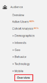 Now we’ll show you how to find out the split of traffic between desktop, mobile and tablet. You’ll need to log in to your Google Analytics account. In the left-hand menu, go to Audience > Mobile > Overview.
Choose a reasonable date range, say the last 6 months. In the table (see below) it will show the number of visits from desktop, mobile and tablet. In brackets next to each figure it will show the percentage.
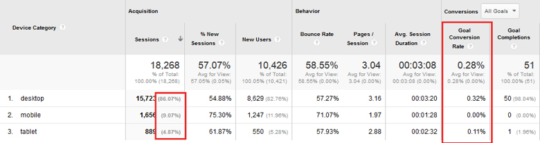
On this particular website there’s around 15% mobile and tablet users. Which means that 15% of users are having a less-than-perfect experience on this non-responsive website. Think about the poor user experience of pinching and zooming. Clicking on the phone number and not being able to call the company. The frustration of more pinching, more scrolling, more zooming. What is the split for your website, are the results surprising?
The leaky bucket: could you have lost £14,000?
The next step is to calculate the potential loss in revenue or enquiries (you’ll need to have goal tracking set up). Staying in the same place in Google Analytics, on the right-hand side of the table, you can see the number of goal completions and the conversion rate for desktop, mobile and tablet. If the conversion rate for mobile and tablet is lower than desktop then let’s work out how many enquiries you could have had, assuming the conversion rate was the same as desktop.
Note down the number of visitors who came from a mobile or tablet (on the left-hand side of the table above). Multiply this by the desktop conversion rate, in this case 0.32%. Now compare this number against the actual goal completions for mobile and tablet, and what is the difference? In the case above, it’s a loss of 7 enquiries. With an average order of £2,000, this equates to a potential loss of £14,000!
If you sell products online, then you can do the same calculations but use ‘goal value’ to work out the impact on sales online. What results did you see? Even if the results are not as bad as you expected, read on to find out the other reasons why responsive is so important.
Going responsive: 5 top reasons to bump it up your priority list
Having calculated the visits and revenue from these different devices, you may or may not have been surprised by the findings. However, putting aside the facts and figures for a moment, do you know the other reasons to make your site responsive?
Reason 1: Reduced management costs
If you currently have a mobile and desktop site, you’ll be managing content in two places. With a responsive site you only need to update content once, saving time and effort on website management.
Reason 2: Google will thank you
Google has now said they will start penalising websites which aren’t responsive. Think of the impact on your SEO rankings and organic traffic. Need we say more?
Reason 3: You’ll be future-proof
Whatever device next hits the shelves, your website will adjust the content and layout to respond to these new devices. One thing to bear in mind is that if users of a specific device really increase, you’ll want to test whether you’re showing the right content and have the best layout for that particular device.
Reason 4: Faster page loading
Because responsive websites are built using one set of code, they’re much faster to load pages. This is because content is tailored for different devices, meaning it will only load the content you choose to be shown when the site is built.
Reason 5: Better usability
No more pinching and zooming, or clicking on the wrong link because your fingers aren’t small enough. Responsive makes it easier to navigate, and quicker to find the information you need. Features like ‘click to call’ are particularly useful if someone is on a mobile and wants to call your business easily from their phone.
A quick summary
So there you have it, the many reasons to make your site responsive. If a high percentage of your users are on mobiles and tablets, and if your conversion rate is being affected, then going responsive is the obvious choice.
However, even if mobile visits are not sky-high, don’t forget the other benefits of a responsive site. Reduced management costs, a friendlier site for Google, faster page loading, better usability and a site which is future-proof. To find out more about how Transcend can help you start the process of going responsive, or if you have any questions just get in touch with the team.